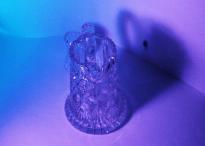


A. The glass photo conveys an emotion that can be interpreted as sad or soothing. The mix of purple and blue makes the glass object have a feeling. The glass show two sides, conveying a sad yet soothing photo. The line between the two colors shows the split of emotions in the photo
B. The glass photo makes me think about a person feeling two different emotions. Maybe they are split on a decision, unsure if they should choose one or the other. The two colors could also interpret the end of a relationship, one soothed and relaxed while the other is sad and unsure. It is interesting and fun to interpret a photo showing only colors.
C. The line splitting the two colors really jumps at me. The two different colors on the glass jumps at me as well, conveying emotion in the photo. It is interesting how the line can represent a split decision or split emotions. The two colors are also interesting as it exemplifies two different colors with different feelings.
D. The photo soothes me but strikes me as a mixed emotion photo. The colors show a soothing yet sad feeling. The photo made me feel a certain way where I was both calm yet sad. The mixed emotions in the photo makes the viewer question the emotions being shown in the photo, making the photo more interesting to interpret.
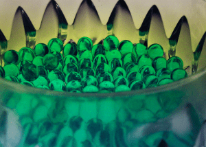
E. For advice on shooting abstract photography, try to make out of the box photos. For the water beads, I tried to make the photo not look like water beads in a jar, but rather using the beads to convey a different emotion and out of the box photo. Try to make a photo that you can enjoy looking at while conveying an emotion. This makes the photo more interesting and fun to look at.
I love the perspective of the picture. I also like the color chosen. Overall, I don’t dislike anything
Try to experiment a little more with different angles. I don’t dislike the angle used but, other angles could’ve been better than the one used.